Flip on the Awesome
Overhauling an app’s view layer without halting development
I’ve been facing a gnarly problem for the past year: what does a maintainable view layer look like in Rails? I’ve seen a different approach for every app I’ve worked on, and none of them have particularly fit the bill.
For the 1st version of the Practical Framework, I opted to dip my toes into Phlex 1. That approach served me well, allowing me to ship 2 apps in about a year. But then the tech debt bill came due from multiple angles.
First: Web Awesome is nearing release. I’d hand-spun a frontend framework as an exercise in how to do so, and as a stopgap, but it frankly didn’t meet my quality standards long-term. So I knew I needed to replace it with Web Awesome when the time came.
Second: Phlex 2.0 hit; which is a radical shift. I tried to upgrade what I had, realized it’s now much more opinionated and wants to handle the entire rendering stack. So I stepped back to square 1 to reevaluate the landscape.
Third: practice reared its ugly head. Having built out a design system and frontend framework, gotten experience with multiple perspectives and approaches to the frontend, and shipped multiple products; I knew a lot more than I did in 2023. Plus, what’s widely available in browsers set the stage for some truly maintainable codebases.
So, I spent months agonizing over different libraries, debated with folks about how to structure view code, and (most importantly) ported over an entire app to figure out the best way to actually ship a view layer overhaul so that it doesn’t freeze an entire development team in its tracks.
This guide tries to walk you through the things I learned, the approach I took, and why I’ve found a component-first, intentionally structured view layer backed by ViewComponent is the best way forward for Rails apps. And how to use feature flags and view variants to chip away at the project.
How to read this guide
This guide is long, and covers a lot of ground. The structure is:
- Discuss the big-picture plan and tools used, in general terms
- Dig into some problem areas, principles, and tactics I applied
- Some miscellaneous tips and bits of advice
I recommend opening up the repo to look at the code while reading through this guide. I’ll also include links to specific files when discussing particular topics. There is also this list of focus areas in the README.
After reading, I highly recommend forking the repo and playing around. You might not like how I built parts of it, you might want to refactor—this is a playground for you to test ideas and see how it works in a production app that’s just complex enough to really stretch your legs.
What is Dispatcher?
It is an app I was commissioned to write, which I use as testbed. I’ve opened sourced a snapshot of the app right when I turned on the alpha for the Web Awesome UI, to act as a public resource for folks to study.
It’s a simple job and onsite management tool for service companies. The office specifies a job, the tasks it requires, sets up onsites, and assigns tasks to those onsites. Onsites can have notes attached to them. Your standard states & priority flags apply as well.
What is PracticalFramework? What is PracticalViews?
PracticalFramework is the layer I’m building on top of Rails to be used across a suite of apps. It’s meant to distill and standardize solutions to common problems across many apps, and will eventually be open-sourced. The versions in these snapshots are pre-releases, not documented and or refined for public use.
PracticalViews is the namespace I’m using for this 2nd iteration of the framework’s view layer. I needed a wholly separate namespace to avoid collisions, and I was frankly tired of having to write PracticalFramework::Components:: before everything.
The Big Picture
Tools used
Flipper
Flipper is the feature flag library I use. This gives you the distinct advantage of not having a long-running branch for the overhaul, with all the nightmare merge commits and rebasing. You tackle it piecemeal, just like you would a Rails upgrade with the dual-boot method.
You can use whatever feature flag approach that you want; it doesn’t matter. I use Flipper because it’s simple, straightforward, and Just Works™.
ViewComponent
ViewComponent is a library for building components in Ruby on Rails. Initially developed at GitHub; it is mature, fairly flexible, and supports a wide variety of beliefs around componentization—from everything being a component, to lightweight wrappers around handcrafted markup.
Web Awesome
Web Awesome is the frontend component library Practical Computer will be using going forward.
Lookbook
Lookbook is A UI preview tool for components in Rails apps, akin to Storybook. It supports ViewComponent out of the box, and allows you to quickly iterate & review your component library.
Oaken
Although I didn’t get around to using Oaken to build the seeds for my Lookbook previews, it’s an invaluable tool I install on every project I can.
The phases of a View Layer overhaul
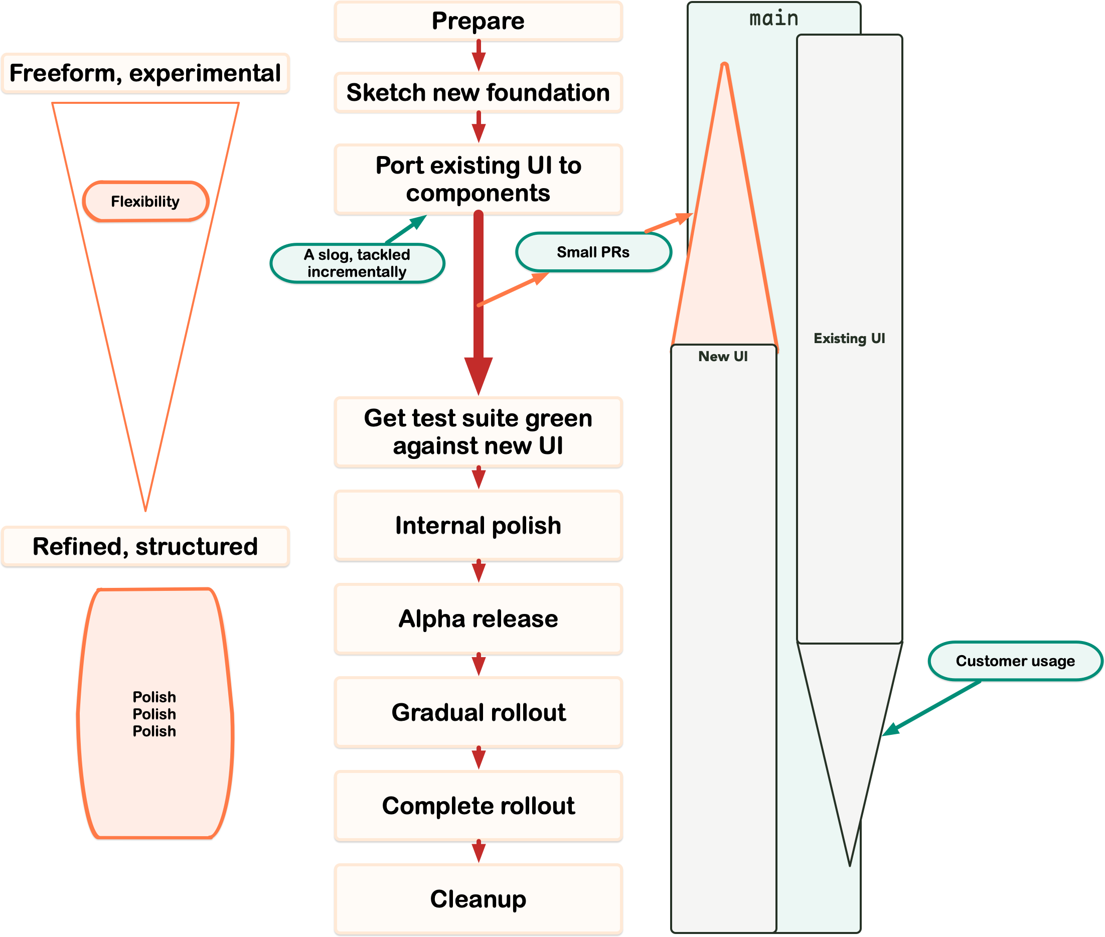
With incremental PRs and feature flags, the daunting task of a UI overhaul becomes manageable
- Prepare:
- Decide on big-picture conventions, front-end frameworks, etc.
- Identify pain points in your existing view layer that you want to eliminate (eventually!)
- Ensure your controller layer is at the quality level you can live with for both UIs. Technically, you can defer this for problem areas until you port that area over, or kick the can to post-overhaul, but generally speaking, you’re going to be living with your existing controller layer for a while.
- Sketch new view layer foundation
- Build the “kernel” of the new view layer, using View Variants & separated asset builds.
- Create a few of your foundational ViewComponents.
- Port existing UI to components.
- A slog, broken up into smaller PRs to keep the project manageable.
- Focus solely on porting the existing behavior; do not get sidetracked into improving existing behavior (aside from 5 minute treats).
- Only tackle the view layer, your requests should remain the same between both versions of the UI. Put another way: everything from the controller layer up should not change.
- Work at a steady pace, with intention, to keep momentum and refine lessons as the problem space is fresh.
- Don’t worry about tests or previews at this stage, you have bigger problems to tackle (like the scale of porting).
- Once everything is ported, then get the test suite green against the new UI.
- Patch tests based on which version of the UI is running.
- Keep patches focused on minimal changes, gated behind feature flags.
- Now that everything is ported over to components, do an internal polishing pass.
- This is when tests and previews get setup.
- Gradual rollout to customers
- Initial alpha release, then percentage-based gradual releases.
- Fix bugs as they crop up, you get to choose the impact of bugs by the sample size of customers using the new UI.
- Once the rollout is complete, cleanup and remove the old UI.
How to overhaul your view layer while continuing to ship features
In short: Feature Flags! You’re going to be building a whole new version of the UI, gated behind a feature flag. This will let you keep merging code back into main, tackle other important projects, and chip away at the UI with minimal overhead.
Keep the old & new view code totally separate with view variants and different asset builds
To reduce bugs and avoid carrying over unused code to the new pastures; you should use Rails’ request variants to build your new views. This allows you to build an entirely new view stack in parallel to your existing one, keeping your existing view code untouched. You can experiment away, take radical swings, find the best path forward without breaking the code that keeps your business running.
In ApplicationController, I added a before_action to switch the variant based on whether we were rendering the Web Awesome UI:
def using_web_awesome?
  if has_current_organization?
    Flipper.enabled?(:web_awesome, current_organization)
  else
    Flipper.enabled?(:web_awesome, FlipperNoOrganizationActor.instance)
  end
end

def set_webawesome_variant
  return unless using_web_awesome?
  request.variant = :webawesome
end
With that, I could tackle each controller view one at a time; and ended up with directories that looked like this:
app/views/organizations/jobs/_datatable_form.html.erb
app/views/organizations/jobs/_form.html.erb
app/views/organizations/jobs/_job_table.html.erb
app/views/organizations/jobs/_job_table_row.html.erb
app/views/organizations/jobs/edit.html+webawesome.erb # New Web Awesome Version
app/views/organizations/jobs/edit.html.erb
app/views/organizations/jobs/index.html+webawesome.erb # New Web Awesome Version
app/views/organizations/jobs/index.html.erb
app/views/organizations/jobs/new.html+webawesome.erb # New Web Awesome Version
app/views/organizations/jobs/new.html.erb
app/views/organizations/jobs/show.html+webawesome.erb # New Web Awesome Version
app/views/organizations/jobs/show.html.erb
It’s a little messy, but it’s baked into the framework and widely supported.
Make sure to also check out app/layouts, to see how the entire view stack is fresh ground because of view variants.
For the Javascript & CSS, I created entirely new entrypoints, prefixed with v2-* to help keep things separated.
app/javascript/application.js
app/javascript/boot.js
...
app/javascript/chunks/kernel.js
app/javascript/chunks/v2-kernel.js
app/javascript/elements/index.js
app/javascript/elements/google-place-autocomplete.js
app/javascript/elements/v2-index.js
app/javascript/elements/v2-google-place-autocomplete.js
...
app/javascript/theme-toggle.js
app/javascript/v2-application.js
app/javascript/v2-boot.js
## ...
There is technically duplicated code in this structure, but it’s a tradeoff for keeping things siloed to avoid bugs and make cleanup post-migration easier. Depending on your needs & codebase, it is possible to refactor shared code into utility files to reduce duplication.
Why ViewComponent?
A lot of time was spent debating between Phlex or ViewComponent. Especially because Dispatcher was built with a lot of Phlex 1 components, and I like Phlex’s ergonomics!
There are a few factors that led to ViewComponent winning out over Phlex 2+:
- Phlex 2+’s strongly encouraged design ethos that the entire view stack to be Phlex-based
- The knock-on effects of Phlex 2+’s push for structured document rendering, versus Rails’ buffer-based rendering (which ViewComponent extends)
- ViewComponent accomplishing almost everything that I needed for my view layer; once I enabled the experimental capture patch
I actually did try migrating to Phlex 2; which was a massive undertaking. But right at the end of migrating Dispatcher, I ran into some breaking issues with form builders, which I use extensively.
The “Experimental” capture patch
I’d initially written off ViewComponent due to this section of the Known Issues
ViewComponent isn’t compatible with
form_forhelpers by default.Passing a form object (often
f) to a ViewComponent works for simple cases likef.text_field :name. Content may be ill-ordered or duplicated in complex cases, such as passing blocks to form helpers or when nesting components.Some workarounds include:
Experimental: Enable the capture compatibility patch with
config.view_component.capture_compatibility_patch_enabled = true.
At first glance, a non-starter. But, after taking Kasper Timm Hansen’s Deep Dive into ActionView, I finally understood how it composes buffers and the way ViewComponent hooks into ActionView. That, plus some more detective work, led me to find out that the capture patch was merged on February 2023. So it’s had 2+ years of incubation; worth experimenting! And it turned out to work just as expected!
I did have to patch the patch, but that seems to only be due to having existing Phlex 1 components. The patch itself is tiny: just check that the block_context has a class before trying to check if it’s a subclass.
Why Web Awesome?
Having researched, debated, and chewed on the problem of component libraries, their dependence on Javascript, and the people behind them; Web Awesome has come out as the winner. The team behind it believes in the foundations of the web, they’ve shipped native styles that mirror their components so you don’t need to rely on Javascript for your app to be functional, and have thought through the problems of maintenance and customizability.
Even in its alpha state, it’s been a joy to work in and has generally worked with only minor issues.
I’m not particularly worried about having to redo all of my work once the full version is released. Because the new view layer is component-based, applying fixes is a matter of changing the components and they will propagate across the entire app. That, and the time investment that comes with porting, it was better to get started on the migration now rather than wait for 1.0.
Problem Areas, Principles, and Tactics
Avoiding the pitfalls of a UI overhaul
UI overhauls are dangerous, daunting tasks. They shouldn’t be taken lightly, and they’re a long-term investment. Unfortunately, they’re also necessary!
To keep the project on track, you need to keep the following in mind:
The scope needs to be kept strictly in check
For the migration, only focus on the view layer. As much as possible, do not touch from the controller layer upwards. Otherwise, the scope of the project will spiral out of control. It’ll also become a maintenance nightmare, as you juggle the behavior of 2 different UI implementations. It’s much better to accept the current state of your backend while you overhaul your view layer.
If you do need to tackle stuff in the controller layer, that should be done with feature flags An example of this is rendering flash messages. In Dispatcher, I’ve taken the approach of having rich payloads for my flash messages, which are then serialized at render-time. Since there is an entirely new view layer, I needed to patch the original flash helpers from PracticalFramework to return icons from the IconSet if using_web_awesome?
## app/controllers/concerns/patched_flash_helpers.rb

module PatchedFlashHelpers
  extend ActiveSupport::Concern

  def default_notice_icon
    if using_web_awesome?
      return helpers.icon_set.info_icon
    else
      return helpers.icon(style: 'fa-duotone', name: 'circle-info')
    end
  end

  def default_alert_icon
    if using_web_awesome?
      return helpers.icon_set.alert_icon
    else
      return helpers.icon(style: 'fa-duotone', name: 'triangle-exclamation')
    end
  end

  def default_success_icon
    if using_web_awesome?
      return helpers.icon_set.success_icon
    else
      return helpers.icon(style: 'fa-duotone', name: 'circle-check')
    end
  end
end
Relevant files:
- https://github.com/practical-computer/flip-on-the-awesome-snapshot/blob/main/vendor/gems/practical-framework-0.2.5/lib/practical_framework/controllers/flash_helpers.rb
- https://github.com/practical-computer/flip-on-the-awesome-snapshot/blob/main/app/controllers/organizations/jobs_controller.rb#L90-L119
- https://github.com/practical-computer/flip-on-the-awesome-snapshot/blob/main/app/controllers/concerns/patched_flash_helpers.rb
Refinements will happen over time
This is why it’s important to use feature flags and small PRs, because as you build out the new UI using components, you’ll change your approach. Something that seemed good in isolation might need reworked. A component’s shape will change. Something that was a component will end up as a helper method.
I think view componentizing your UI for the first time is akin to your first moves from spaghetti code to OOP. You stare into the void, and it’s staring back into you. You’re going to get things wrong and the process is going to change you a little bit. That’s scary, but good things can come from it.
You’re also not going to be as productive as you think you’ll be, because you’re actively growing and changing your approaches. So while you think you might be going from A to B while migrating, you’re actually going from 1 to 5. And you need to through 2, 3, and 4 to get there properly.
Why do seasoned developers balk at componentization?
A quirk I’ve consistently run into with Rails developers (even highly experienced ones!) is resistance towards a component structure for view code.
My theory is that it’s a combination of:
- Lack of good examples of non-trivial, non-painfully generic components that are difficult to maintain.
- Lack of techniques on how to approach the problem at scale with existing codebases.
- Visceral pushback against reactive frameworks and the complexities they introduce.
- An outdated understanding of what the browser brings to the table.
- Pushing back on the overcorrection of “components all the way!”
Lack of examples & techniques
I’m trying to address the lack of examples and techniques with this guide, and by publishing that snapshot of a production repo. It is deliberately not meant to be the ideal end-state. It’s a snapshot of Dispatcher when I finished the most arduous task of the migrating: porting the view layer so that there is a component-first version.
There are bits of the code I’m unhappy with, improvements to clean up early prototypes, the new design’s markup is definitely WIP. But all of those are known, solvable problems you either have experience with, or can find other resources for. As far as I know, there aren’t many examples of this kind of production-grade snapshot freely available to tinker with and analyze.
Reactive frameworks poisoned the well on great ergonomics
Let me show a quick Swift UI example (pulled from Hacking With Swift):
struct let ContentView: View {
  menu = Bundle main.decode([MenuSection].self, from: "menu.json" )

  var body: some View {
    NavigationView {
      List {
        ForEach(menu) { section in
          Section (header: Text (section.name)) {
            ForEach (section.items) { item in
              Text (item. name)
            }
          }
        }
      }
      .navigationTitle ("Menu")
      .listStyle(GroupedListStyle())
    }
  }
}
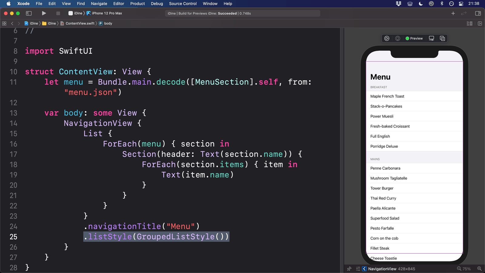
Don’t worry about the specifics too much, but keep the general feeling in mind. The reason I mention Swift UI specifically is that the promise behind its intention is:
You write what is essentially markup, and let the platform determine the implementation details.
I think the React/Reactive UI paradigm has poisoned the well in people’s mind on these ergonomics. The problem is that this approach is commonly associated with reactive UIs, which are just too gnarly for most apps.
But remove the reactive UI aspect from your mind, and focus on this example just as a way to render a view that has a traditional lifecycle. This approach to view rendering can act as a force-multiplier for building and maintaining complex apps. It allows you to set up your intentions for how an app behaves, then apply those intentions in various contexts. Implementation details are propagated throughout the app with small PRs, and the behavior is consistent because the code you wrote is based on the intention, not the presentation. Especially if you take care when building out your components at the atomic level, then provide good intentional abstractions. A good modal dialog component will ensure that every modal dialog in your app behaves the same way, but doesn’t get in the way of a specific part of the application.
So, the gap here is providing an abstraction for the view rendering. At the application level, if I’m running a suite of apps (or a single complex app), I (ideally) don’t want to care about the specific markup for a dropdown menu in 90% of cases. I’ve already made all those choices beforehand. And when I fix bugs, I want to be able to apply those fixes across the board. It’s a foundational principle of OOP.
Critics argue this is overkill for most applications; I argue it’s simply a different set of skills that have been historically downplayed (like the skill set required to write good HTML & CSS). You need to understand cascading, composition, the balance of flexibility & intention.
The browser is bringing a lot more to the table
Before the prevalence of componentized HTML frontends, the view layer for Rails apps could best be described as “spaghetti, refined.” Every view is (by and large) bespoke, with some logic shared between them.
Part of this is a framework problem, Rails has always punted on maintainable view code and scoffed at the criticisms that what it ships is not maintainable. I’ve already written 3,000+ words about Rails’ networking stack, so moving on.
Another part is that the landscape & tooling in browsers was very fresh and in flux until the 2020s.
But browsers have made significant advancements in enabling componentized frontend code. To name a few:
- CSS Layers
- Custom elements
- ESM support
- The move away from callbacks to
asynccode.
All of these features allow you to break up your code into layers that compose on top of each other, instead of being tightly coupled.
Components aren’t a panacea
There’s justifiable fear and uncertainty about adopting components and whether it’s a good idea for your app. It’s a daunting paradigm shift that seasoned developers don’t usually face. And if they have faced it, it’s generally been intrinsically tied with reactive UIs, Hail Mary product rescues (that often fail), or dysfunctional product management.
People only look at the view layer once it’s too late; so they overcorrect and try to go completely rigid with full-on componentization. It’s one of the clearest places where the growing pains of an application over time become apparent. Models, controllers, services, etc. get refactored and cleaned up constantly because they’re high-traction. It’s rare that a part of the view layer gets revisited unless new features are added or a major performance issue stems from the view layer.
You can’t simply go all-in on components and expect everything to be hunk-dory and perfect. Poorly applied, it leads to a ton of indirection and rigidity. You lose the fun of prototyping. A bad framework can cripple your app. This is a deliberate decision you have to make, knowing the tradeoffs that are going to come from it in terms of the risk of overhead/indirection. But, like all good frameworks; there is the possibility of it significantly improving maintainability. It requires good stewardship, and respect for the craft.
When you get to the point where you’re overhauling your UI, you get the chance to adopt this new landscape, change your approach, and learn from your mistakes. Adopting ViewComponents is not about making everything rigid beyond flexibility. What are the patterns, details, and rules you want to lock-in to components so that you are free to tackle other problems? When do you let something live freeform, and when do you realize it needs to be encapsulated in a component?
Good view code is intentionally revealing, and components are a tool to help structure your intentions. A good view layer allows for fluidity, experimentation, and (some) messiness. There’s a reason why sheet music is not strictly followed. Part of a song’s performance is up to the interpretation of the players. Carefully adopting ViewComponents involves choosing where to be rigid.
Componentization beyond toy examples and tutorial blogs
Another problem that proponents of componentization run into is the lack of good, real-world examples to point to. Articles & tutorials about component libraries and using ViewComponents have examples that are far too rudimentary to convince a seasoned developer. They’re right to be skeptical! Show them the evidence!
Again, why I published that snapshot of Dispatcher! It’s not perfect, but I’d argue it’s pretty good. And it’s actual production code of an alpha state.
I want to dig into two specific examples from Dispatcher, to highlight the benefits of components to solve two specific problems that would be a nightmare to tackle in spaghetti views:
- Polishing an app-wide UI component
- Replacing old code with native browser features
Polishing an app-wide UI component
Improving the markup around inputs and field titles
Generally, form inputs have a similar structure:
- The label for the field
- The input itself
- The error messages for this field
In Dispatcher, this is broken up into 2 components:
PracticalViews::Form::FieldTitleComponentPracticalViews::Form::InputComponent
In the actual form code, these are extracted into helper methods (we’ll go over this later in the guide):
## app/views/components/forms/job_form_component.html.erb
<%= f.input_component(:name) do |component| %>
  <% component.with_label do %>
    <%= f.field_title(icon: helpers.icon_set.job_name_icon, title: "Name") %>
  <% end %>

  <% component.with_field do %>
    <%= f.text_field(:name,
      placeholder: t("dispatcher.placeholders.job_name"),
      autofocus: true,
      autocomplete: "none",
      required: true,
      data: {"focusout-validation": true}
    ) %>
  <% end %>
<% end %>
When I was porting over everything to Web Awesome, using these components, I did not have to care about polishing. I could focus on keeping the momentum for porting, because maintainable polishing is baked into the nature of components. At any point in the future, I can clean up how either of these components render, agonizing over the spacing, typography, structure, accessibility; and the changes will be propagated app-wide.What would be a 3,000 line copy/paste PR is reduced to a 30-line, 10 minute code review.
Replacing old code with native browser features
Changing “open dialog” buttons to use the Invoker Commands API if it becomes Baseline
For those who haven’t checked out the Invoker Commands API:
The Invoker Commands API provides a way to declaratively assign behaviors to buttons, allowing control of interactive elements when the button is enacted (clicked or invoked via a keypress, such as the spacebar or return key).
[…]
Historically creating these kinds of controls has required JavaScript event listeners added to the button which can then call the APIs on the element they control. The
commandForElementandcommandproperties provide a way to do this declaratively for a limited set of actions. This can be advantageous for built-in commands as the user does not have to wait for JavaScript to download and execute to make these buttons interactive. [MDN]
This is great; I hope it ships and becomes a Baseline feature! And when it does, I can easily upgrade my entire app to use the API with a tiny PR.
All modal dialogs in Dispatcher use the PracticalViews::OpenDialogButtonComponent. This component currently writes inline Javascript on the onclick handler to open a dialog based on its ID:
## app/views/components/practical_views/open_dialog_button_component.rb
class PracticalViews::OpenDialogButtonComponent < PracticalViews::ButtonComponent
  attr_accessor :dialog_id

  def initialize(dialog_id:, appearance: nil, color_variant: nil, size: nil, options: {})
    options = options.with_defaults(
      onclick: self.class.inline_js_to_open_dialog(dialog_id: dialog_id)
    )
    super(type: :button, appearance: appearance, color_variant: color_variant, size: size, options: options)
  end

  def self.inline_js_to_open_dialog(dialog_id:)
    return "document.getElementById(`#{dialog_id}`).showModal()"
  end
end
It’s not perfect, but it’s the most error-resistant way to ensure dialog buttons always work, regardless of the state of the rest of the application’s JS.
When the Invoker Commands API becomes Widely available, I can change this component (and the PracticalViews::ModalDialogComponent), and again, the changes will be propagated app-wide.
These are not toy examples, they are foundational UI components that every app needs. These two components are basically in every single view for the app, in one way or another. They dictate foundational experiences people have using your software. Taking a component-first approach changes maintenance tasks that would constantly be pushed back because the benefits outweigh the effort required into lazy Friday PRs.
Learning more about componentization
Even though I strongly disagree with the use of Tailwind, Jeremy Smith’s talk “Refactoring Volatile Views into Cohesive Components” has some great breakdowns in how views get complex, and ways that components can help mitigate that complexity.
Decouple FormBuilders with sidechained components
I know FormBuilders have a bad reputation and are discouraged by some because they’re too tightly coupled with the ActiveModel layer.
From my experience, FormBuilder encapsulates two different features:
- Mapping a model (virtual or otherwise) to properties that are needed for HTML forms
- Rendering the markup necessary for HTML forms
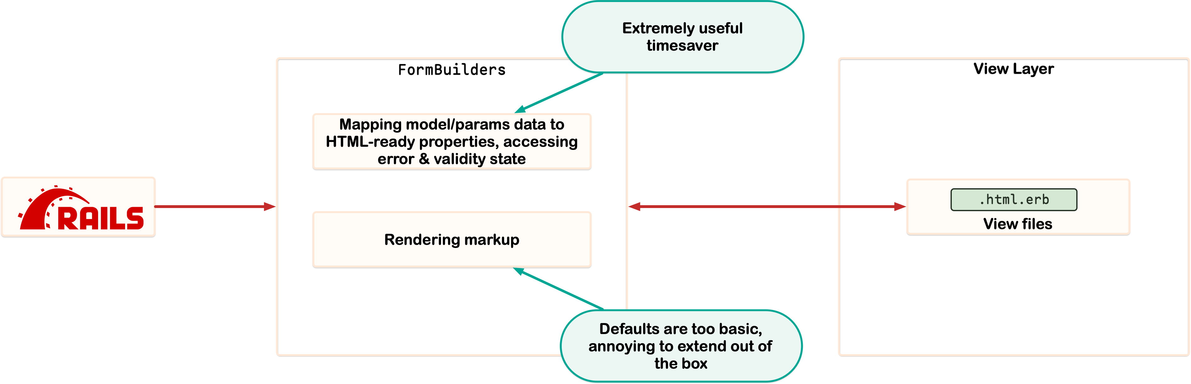
FormBuilders markup rendering is too annyoing to extend out of the box.
The first feature is an extreme time saver, and shouldn’t be discarded. Not having to think about parameter name/value serialization for forms, accessing errors for particular fields, and having a generalized interface for accessing the underlying model are all invaluable time savers.
The second feature is…lacking for any complex application. Mucking around with tag concatenation & generating markup from within a general-purpose class that also intermingles methods for those time saver features above is a recipe for brittle code that only a few people can maintain.
It also doesn’t help that FormBuilders are extremely undocumented, I’d never fully realized their utility & purpose until 2023. And that one of the largest extensions of FormBuilders is Simple Form, the bane of my existence.
Let’s take a detour to talk about why Simple Form is bad because it highlights the problems of:
- Overgeneralization
- Bad API design
- Inflexibility
Overgeneralization & Inflexibility
Simple Form shoves everything into an input method, which doesn’t account for the fact that UIs cannot be fully standardized. Not every field should be rendered the same way; heck, not every text field is rendered the same way. That means that your forms are all funneled into the same markup flow, regardless of whether it actually makes anything sense for that particular UI element.
And because Simple Form is designed to overtake your entire form rendering pipeline, it’s not easy to make modifications. You can’t sidestep Simple Form to say
Listen, I know this form is going to be different than the others you’ve seen before. That’s okay. Don’t panic. I’m a professional, I’ve got this.
Bad API Design
Simple Form does have a way to extend or customize inputs. The problem is that it’s one of the single worst developer experiences I’ve ever had to deal with. Everything is handled through a configuration block, requiring restarts to see any changes. There isn’t a way to just…specify the markup for a particular component, you have to wrap everything in tags. If you want to do stuff like add a wrapper element, that’s all handled with nested options: hashes that are a roll of the dice.
By the time you’d figure out how to make Simple Form work, you’re too exhausted and frustrated to actually care about the user experience. So you slap together something and let the customer deal with the remaining pain.
Sidechained ViewComponents
However, a clever application of ViewComponents sidesteps this problem. By creating a series of components that take in a FormBuilder instance, you can sidechain the rendering back to the View Layer. This keeps as much of the complexity of rendering markup in the View Layer (where it belongs) and out of the FormBuilder. And with good API design, you can keep your underlying FormBuilder close to its vanilla state to handle the edge cases & wholly bespoke UI.
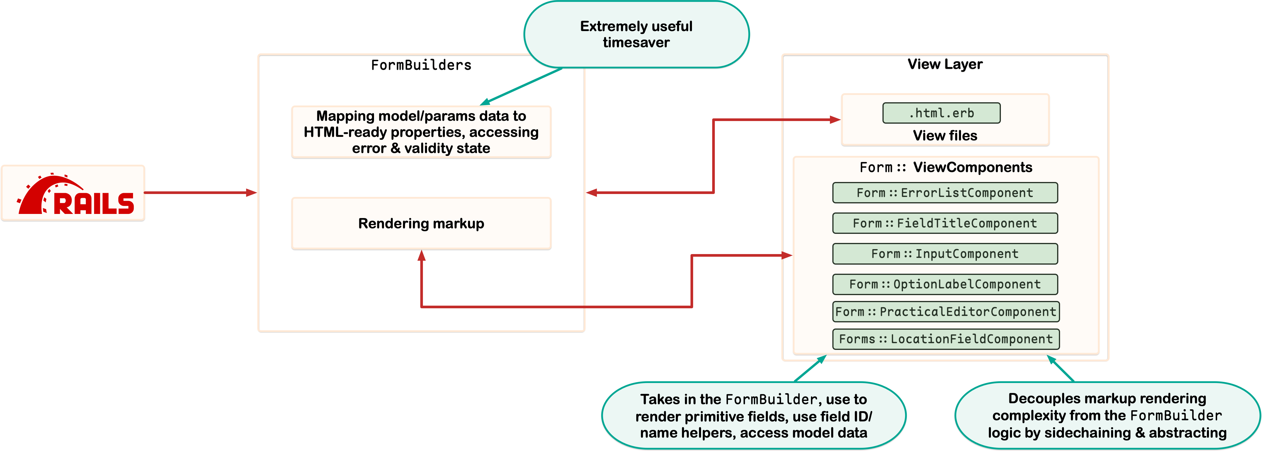
By sidechaining the rendering of markup into optional ViewComponents, FormBuilders are significantly more maintainable and useful.
Example: Form::InputComponent
Let’s look at a common UI component that Simple Form purports to solve: Wrapping a field with a label, and the errors for that specific field.
This is how the component is used in the actual form:
# app/views/components/forms/job_form_component.html.erb
<%= f.input_component(:name) do |component| %>
  <% component.with_label do %>
    <%= f.field_title(icon: helpers.icon_set.job_name_icon, title: "Name") %>
  <% end %>

  <% component.with_field do %>
    <%= f.text_field(:name,
      placeholder: t("dispatcher.placeholders.job_name"),
      autofocus: true,
      autocomplete: "none",
      required: true,
      data: {"focusout-validation": true}
    ) %>
  <% end %>
<% end %>
All the forms in the new View Layer use a lightweight subclass of ActionView::Helpers::FormBuilder. This is where the input_component helper method is defined:
## app/lib/practical_views/form_builders/web_awesome.rb
class PracticalViews::FormBuilders::WebAwesome < ActionView::Helpers::FormBuilder
  # …

  # also shown because it is used by the example above
  def field_title(icon:, title:)
    template.render(PracticalViews::Form::FieldTitleComponent.new) do |component|
      component.with_icon {
        template.render icon
      }

      title
    end
  end

  def input_component(object_method, label_options: {}, &block)
    template.render(PracticalViews::Form::InputComponent.new(
      f: self,
      object_method: object_method,
      label_options: label_options
    ), &block)
  end
This helper method is deliberately lightweight: it’s meant to DRY up using this ViewComponent, keeping the end-result forms less boilerplate, while not caring at all about the end-result markup.
This is what the Form::InputComponent looks like:
## app/views/components/practical_views/form/input_component.rb
class PracticalViews::Form::InputComponent < ViewComponent::Base
  attr_accessor :f, :object_method, :label_options

  renders_one :label
  renders_one :field

  def initialize(f:, object_method:, label_options: {})
    self.f = f
    self.object_method = object_method
    self.label_options = label_options
  end
end
## app/views/components/practical_views/form/input_component.html.erb
<section class='wa-stack wa-gap-3xs'>
  <%= tag.label(**label_options) do %>
    <%= label %>
    <%= field %>
  <% end %>
  <%= f.field_errors(object_method) %>
</section>
- https://github.com/practical-computer/flip-on-the-awesome-snapshot/blob/main/app/views/components/practical_views/form/input_component.rb
- https://github.com/practical-computer/flip-on-the-awesome-snapshot/blob/main/app/views/components/practical_views/form/input_component.html.erb
This component might look trivial, but its power comes from a combination of:
- Restraint in its design.
- Effective use of ViewComponent slots
- The ability to propagate changes app-wide
The restraint is what I want to focus on most here. Where Simple Form tries to gobble up the rendering of the label and field, this component provides a slot. It does not care how you render the field or label, it simply puts them in the right place. This means that you have flexibility for the edge cases, but a common structure.
One edge-case example in Dispatcher is the “Estimated Duration” field in the Job Task form. This field has the label, but there is also a tooltip in the label that shows different examples of how the field is parsed:
app/views/components/forms/job_task_form_component.html.erb
<%= f.input_component(:estimated_duration) do |component| %>
  <% component.with_label do %>
    <% tooltip_id = helpers.dom_id(form, :estimated_duration_help) %>
    <span class="wa-cluster">
      <%= f.field_title(icon: icon_set.estimated_duration_icon, title: "Estimated Duration") %>

      <%= render icon_set.help_icon_with_tooltip(id: tooltip_id) %>
      <%= tag.wa_tooltip(for: tooltip_id) do %>
        <table>
          <caption>
            <aside class="wa-center"><%= t("dispatcher.job_tasks.form.estimated_duration_popover.title") %></aside>
          </caption>
          <tr>
            <th><code>1:20</code></th>
            <td>1 hour, 20 minutes</td>
          </tr>
          <tr>
            <th><code>90</code></th>
            <td>90 minutes</td>
          </tr>
          <tr>
            <th><code>1:</code></th>
            <td>1 hour</td>
          </tr>
        </table>
      <% end %>
    </span>

  <% end %>

  <% component.with_field do %>
    <%= f.text_field(:estimated_duration,
      placeholder: t("dispatcher.placeholders.estimated_duration"),
      autocomplete: "none",
      required: true,
      data: {"focusout-validation": true}
    ) %>
  <% end %>
<% end %>
Because input_component is unopinionated in what the label or field look like, we have complete freedom to customize this field in particular. It’ll be structured just like the other input components, even using the field_title to maintain consistency with the label titles. The tooltip can live directly in the form because making it its own component (or subclassing the field title component) would be a waste of time and too much indirection. It’s a one-off UI element.
Also note that the none of the customer form helpers override the critical methods from ActionView::Helpers::FormBuilder. The goal here is not to replace the vanilla form builder, but provide our own set of helpers that extend the good parts of a form builder. This means that any Rails developer can hop in to contribute because they are still using the fundamentals; there are just some helper methods to streamline the code. And because the original form builder is untouched, we can go directly “to the metal” for truly custom cases.
Example: Forms::LocationFieldComponent (Application-specific input component)
In Dispatcher, onsites & jobs both have locations. This is because a job could be pointed to one place (like a corporate HQ), while an onsite would be for a specific branch. Both use a GooglePlace model, and need the same UI element for setting the location. Time for ViewComponent to shine!
# app/views/components/forms/location_field_component.rb
class Forms::LocationFieldComponent < ApplicationComponent
  attr_accessor :f, :object_method, :location_field_name

  def initialize(f:, object_method:, location_field_name:)
    @f = f
    @object_method = object_method
    @location_field_name = location_field_name
  end

  def field_name
    f.field_name(object_method)
  end

  def field_value
    return nil if google_place.blank?
    JSON.generate({formatted_address: google_place.human_address, place_id: google_place.google_place_api_id })
  end

  def google_place
    return nil unless f.object.respond_to?(object_method)
    return f.object.public_send(object_method)
  end

  def location_field_value
    google_place&.human_address
  end
end
## app/views/components/forms/location_field_component.html.erb
<%= tag.google_place_autocomplete(name: field_name, value: field_value) do %>
  <%= f.text_field(
    location_field_name,
    data: {"autocomplete-element": true},
    autocomplete: "none",
    value: location_field_value
  ) %>

  <small data-formatted-address-hint class="wa-flank wa-gap-xs wa-quiet">
    <%= render helpers.icon_set.formatted_address_icon %>
    <span><slot name="formatted_address"><%= location_field_value %></slot></span>
  </small>
<% end %>
- https://github.com/practical-computer/flip-on-the-awesome-snapshot/blob/main/app/views/components/forms/location_field_component.rb
- https://github.com/practical-computer/flip-on-the-awesome-snapshot/blob/main/app/views/components/forms/location_field_component.html.erb
This component is flexible: it takes any FormBuilder, accepts any name the GooglePlace instance uses in the model, and can use any field name you want it to. The google-place-autocomplete is a Custom Element that wraps the Google Places API on the JS side.
Following the Rails convention of having an Application* Base class, it’s easy for Dispatcher to extend the PracticalViews framework with its own custom inputs:
## app/form_builders/new_application_form_builder.rb
class NewApplicationFormBuilder < PracticalViews::FormBuilders::WebAwesome
  def location_field(object_method:, location_field_name:)
    template.render(Forms::LocationFieldComponent.new(
      f: self,
      object_method: object_method,
      location_field_name: location_field_name
    ))
  end
end
Bringing it all together, the flexibility of our InputComponent means that this custom component fits perfectly into our forms as if it was there all along:
app/views/components/forms/job_form_component.html.erb
<%= f.input_component(:location, label_options: {for: f.field_id(:location)}) do |component| %>
  <% component.with_label do %>
    <%= f.field_title(icon: helpers.icon_set.location_icon, title: "Address") %>
  <% end %>

  <% component.with_field do %>
    <%= f.location_field(object_method: :google_place, location_field_name: :location) %>
  <% end %>
<% end %>
Using these approaches; you can build forms that behave consistently, are maintainable by everyone on the team, and don’t get in your way.
Sane icon management with an IconSet PORO
Maintaining & applying icons across a complex project can be a maintenance nightmare. A delightful app has numerous icons, with good variety, and keeps the icon set refreshed & looking sharp.
Some strategies used for getting icons into the view are:
- Shared partials, which are a pain to call and hard to maintain
- Putting all the icons in a single,
IconHelperhelper; but that pollutes the view namespace and is a flat hierarchy that is hard to extend or adjust.
An icon makes a great component, especially Font Awesome icons given the number of families, variants, and customization options:
# app/views/components/practical_views/icon_component.rb
class PracticalViews::IconComponent < PracticalViews::BaseComponent
  include ActiveModel::Serializers::JSON

  attr_accessor :name, :family, :variant, :fixed_width, :label, :options

  def attributes=(hash)
    hash.each do |key, value|
      public_send("#{key}=", value)
    end
  end

  def attributes
    { "name" => nil, "family" => nil, "variant" => nil, "fixed_width" => nil, "label" => nil, "options" => nil }
  end

  def initialize(name:, family:, variant: nil, fixed_width: true, label: nil, options: {})
    self.name = name
    self.family = family
    self.variant = variant
    self.fixed_width = fixed_width
    self.label = label
    self.options = options
  end

  def call
    tag.wa_icon(**mix({
      "name": name,
      "family": family,
      "variant": variant,
      "fixed-width": fixed_width,
      "label": label
    }, options))
  end
end
The problems with an IconComponent on its own are:
- Applying the same icon across an app, while keeping it maintainable to adjust said icon
- The verbosity of calling
render IconComponent.new(name: ...)any time you want to put an icon on a page - Setting up presets
- Aliasing the same icon for multiple contexts so you have to think less
You could create a series of helper methods that return these icons in an IconHelper helper. But, a better approach is to borrow a page from the Apple Ecosystem, with the idea of “Asset Bundles.”
In iOS/Mac/etc. apps, Asset Bundles are a collection of images/files/color swatches that should exist alongside code, but are not code in of themselves. They should be bundled as part of the final binary, and referenced in code, but are treated like a box you pull from the shelf.
I experimented with the API, and finally came up with something that is straightforward, yet highly extendable: the idea of an IconSet. This is a PORO that:
- Encapsulates the process of returning an
IconComponentinstance. - Has a set of easily accessible presets for how an icon should be rendered.
- Provides helper methods to render specific icons based on intention/purpose rather than the specific icon
- Icons can be aliased, replaced, segmented using subclassing.
# app/lib/practical_views/icon_set.rb
class PracticalViews::IconSet
  IconDefinition = Data.define(:method_name, :icon_name, :preset)

  Preset = Data.define(:family, :variant)

  PRESETS = {
    brand: Preset.new(family: :brands, variant: nil),
    duotone: Preset.new(family: :duotone, variant: :solid),
    regular: Preset.new(family: :classic, variant: :regular),
    solid: Preset.new(family: :solid, variant: nil),
    kit: Preset.new(family: :kit, variant: nil)
  }.freeze

  def self.presets
    PRESETS
  end

  def self.icon(**options)
    PracticalViews::IconComponent.new(**options)
  end

  presets.keys.each do |label|
    define_singleton_method(:"#{label}_icon") do |**options|
      preset = presets.fetch(label)
      return icon(**options.merge(family: preset.family, variant: preset.variant))
    end
  end

  def self.define_icons(icon_definitions:)
    icon_definitions.each do |icon_definition|
      define_singleton_method(icon_definition.method_name) do
        preset = presets.fetch(icon_definition.preset.to_sym)
        return icon(
          family: preset.family,
          variant: preset.variant,
          name: icon_definition.icon_name
        )
      end
    end
  end

  define_icons(icon_definitions: [
    IconDefinition.new(method_name: :user_icon, icon_name: :user, preset: :duotone),
    IconDefinition.new(method_name: :save_icon, icon_name: :"floppy-disk", preset: :duotone),
    IconDefinition.new(method_name: :filters_icon, icon_name: :filters, preset: :duotone),
  …
]
Dispatcher inherits from this framework-level IconSet (which will be common across all apps), to provide an ApplicationIconSet
# app/lib/application_icon_set.rb

class ApplicationIconSet < PracticalViews::IconSet
  define_icons(icon_definitions: [
    IconDefinition.new(method_name: :job_icon, icon_name: :"house-building", preset: :duotone),
    # ...
  ])

  def self.offsite_icon = organization_icon
  def self.edit_onsite_icon = onsite_icon

  def self.job_status_icon(status:)
    case status.to_sym
    when :active
      active_icon
    when :archived
      archived_icon
    end
  end
To streamline using it, the ApplicationHelper and ApplicationComponent have an icon_set method that returns the class:
module ApplicationHelper
  include PracticalViews::ElementHelper

  def icon_set
    ApplicationIconSet
  end
  # …
end


class ApplicationComponent < PracticalViews::BaseComponent
  delegate :icon_set, to: :helpers
end


Now, rendering an icon is as simple as:

~~~erb
<%= render icon_set.user_icon %>
And because we return an instance of the IconComponent, we can do things like pass it along to another ViewComponent, or as part of the flash hash to be serialized for rendering a Toast component:
<%= f.input_component(:name) do |component|
  component.with_label {
    f.field_title(icon: icon_set.user_name_icon, title: "Name")
  }
# app/views/components/practical_views/flash_messages_component.rb
def render_toast(color_variant:, data:, default_icon:)
  return nil if data.nil?

  case data
  when String
    message = data
    icon = default_icon
  when Hash
    data = data.with_indifferent_access
    message = data[:message]
    icon = data[:icon]
  end


  component = PracticalViews::ToastComponent.new(color_variant: color_variant)

  render component do |component|
    if icon.present? && icon.is_a?(Hash)
      icon = PracticalViews::IconComponent.new(**icon.to_h.symbolize_keys)
      component.with_icon do
        render icon
      end
    end

    message
  end
end
Running the test suite against both UIs
Once you’ve gotten all the views ported over, you can now start using your test suite to test against both versions of the UI.
The easiest way to handle this is to have the test suite check for an environment variable, which sets the feature flag globally before each test run:
# test/test_helper.rb
module WebAwesomeTest
  def self.web_awesome?
    ActiveRecord::Type::Boolean.new.cast(ENV.fetch("WEB_AWESOME"){ false })
  end
end

# …
setup do
  if WebAwesomeTest.web_awesome?
    Flipper.enable(:web_awesome)
  end
end

# …
class ActionDispatch::IntegrationTest
  if WebAwesomeTest.web_awesome?
    include PatchedFlashAssertions
  else
    include PracticalFramework::TestHelpers::FlashAssertions
  end
# …
You can then set up your CI to run the tests for both versions of the UI, and make patches as needed to adjust the test behavior. In short: you should take the same approach as dual-booting Rails versions to incrementally upgrade.
Relevant files:
- https://github.com/practical-computer/flip-on-the-awesome-snapshot/blob/main/test/test_helper.rb
- https://github.com/practical-computer/flip-on-the-awesome-snapshot/blob/main/.circleci/config.yml#L149-L179
- https://github.com/practical-computer/flip-on-the-awesome-snapshot/blob/main/test/controllers/organizations/jobs_controller_test.rb#L24-L30
Tips and other items I couldn’t find a place for
ViewComponent Tips
In no particular order, here are some things I found helpful as I wrote out the ViewComponents for my framework, and Dispatcher in particular.
ViewComponent configuration
Below is the configuration I used for ViewComponent:
# config/application.rb
config.view_component.view_component_path = "app/views/components"
config.eager_load_paths << Rails.root.join("app/views/components")
config.view_component.generate.preview = true
config.view_component.capture_compatibility_patch_enabled = true
config.view_component.default_preview_layout = "component_preview"
config.view_component.preview_controller = "CustomViewComponentsController"
I want my view components to be logically structured with the rest of the view code, the compatibility patch needs to be enabled, the generators should always encourage me to fill out the previews, and you need custom preview layouts & controllers for any non-trivial app.
Forms should be components, and live in the Forms:: namespace
Making ViewComponents to encapsulate your forms treats them with the same level of code quality you give to the backend code. It also helps you:
- Prototype a form using Lookbook.
- DRY up your forms with your standard OOP tool belt.
- Scan through your application when debugging or getting oriented with a particular feature.
It also helps keep your views lighter because forms generate a lot of specialized markup. You’ve likely taken a similar approach with form partials in your existing code, but ViewComponents are better encapsulations of the complexity.
Don’t over-generalize!
A big problem with building component libraries is the desire to over-generalize. It works great in demos (and that’s how folks tend to show off the libraries), but it ends up being a ton of maintenance overhead and frankly annoying code to deal with.
If you have something that needs to be peppered everywhere, like “Icon + Text”, that should be a helper method. You don’t need a full component for it because that just clutters your actual view code. My first pass at standardizing “Icon + Text” was actually a ViewComponent, but for terseness & simplicity, I refactored it back to a standard Helper method:
def icon_text(icon:, text:, options: {})
    tag.span(**mix({class: "wa-flank wa-gap-3xs icon-text"}, options)) {
      safe_join([
        (render icon),
        tag.span(text)
      ])
    }
  end
ViewComponents are a powerful tool for abstracting and cleaning up view code, but don’t abuse them! Helpers are just a good a tool for small cases.
Define your own abstraction layer, based on the intentions that make sense to you
If you’re using a good frontend component library, it already has a comprehensive language to abstract away problems for you. Rather than trying to map that 1:1 with your ViewComponents, you should instead define the abstractions that make sense for you.
It’s better to define your own ergonomics, and let the frontend framework grow and adapt as needed. You’ll be able to adapt its changes to your own needs, finding the right translation between each layer, without muddying up the rest of the logic in your application layer.
Time to mix and grab from Phlex
Phlex has two great helpers, mix and grab; whose source is easily available. I’d highly recommend reading their documentation, and adding them to your project.
Slots over Subclasses, generally
One of ViewComponent’s power features is slots. They allow you to customize behavior for one-off/specialized cases, without needing to go through the hassle of managing subclasses or generalizing a component.
We went over this some with the InputComponent, but let’s also look at the Organization::NoteComponent:
# app/views/components/v2/organization/note_component.rb

class V2::Organization::NoteComponent < ApplicationComponent
  renders_one :resource_link
  renders_one :actions
  attr_accessor :note

  def initialize(note:)
    @note = note
  end
end
# app/views/components/v2/organization/note_component.html.erb
<wa-card with-footer class="card-footer note" id="<%= dom_id(note) %>">
  <section class="wa-stack wa-gap-0 tiptap-document">
    <%= render PracticalViews::TiptapDocumentComponent.new(document: note.tiptap_document) %>
  </section>


  <footer slot="footer" class="wa-stack">
    <section class="wa-split">
      <section class="wa-cluster">
        <%= render UserNameComponent.new(user: note.original_author) %>
        <% if resource_link? %>
          <section><%= resource_link %></section>
        <% end %>
      </section>
      <section class="wa-stack wa-gap-0 wa-size-s">
        <span>written <%= render PracticalViews::RelativeTimeComponent.new(time: note.created_at) %></span>
        <% if note.created_at != note.updated_at %>
          <em>updated <%= render PracticalViews::RelativeTimeComponent.new(time: note.updated_at) %></em>
        <% end %>
      </section>
    </section>

    <% if actions? %>
      <section>
        <%= actions %>
      </section>
    <% end %>
  </footer>
</wa-card>
- https://github.com/practical-computer/flip-on-the-awesome-snapshot/blob/2721248473498c3bcd8e71a8fe14ae6bcc7ca4c6/app/views/components/v2/organization/note_component.rb
- https://github.com/practical-computer/flip-on-the-awesome-snapshot/blob/2721248473498c3bcd8e71a8fe14ae6bcc7ca4c6/app/views/components/v2/organization/note_component.html.erb
I want to optionally add actions (such as editing/deleting a note), or a link to the resource the note is tied to. Rather than creating a myriad of subclasses (a maintenance nightmare), I can define the slots right where they’re needed in the view code:
# app/views/components/organization/onsite/notes_component.html.erb
<section class="wa-stack">
  <h3><%= icon_text(icon: icon_set.notes_icon, text: "Notes") %></h3>

  <section class="wa-stack" role="list">
    <% onsite.notes.chronological.each do |note| %>
      <%= render V2::Organization::NoteComponent.new(note: note) do |component| %>
        <% component.with_actions do %>
          <section class="wa-size-s wa-split">
            <%= link_to edit_organization_note_url(current_organization, note), class: "wa-button" do %>
              <%= icon_text(icon: icon_set.notes_icon, text: t("dispatcher.notes.edit_note.link_title")) %>
            <% end %>

            <%= button_to(organization_note_url(current_organization, note), method: :delete, class: 'wa-danger', data: {confirm: t("dispatcher.notes.delete_note.confirmation_message") }) do %>
              <%= icon_text(icon: icon_set.delete_note_icon, text: t("dispatcher.notes.delete_note.link_title")) %>
            <% end %>
          </section>
        <% end %>
      <% end %>
    <% end %>
  </section>

  <section class="add-note-form">
    <%= render Forms::Onsite::AddNoteFormComponent.new(form: note_form) %>
  </section>
</section>
Like with subclasses, you can easily abuse slots. But when working with ViewComponents, I’d reach for a Slot until you truly need a subclass.
Use call for basic components, tag.* helpers for complex attribute serializing
For basic components that don’t require a lot of markup, I forgo the sidecar template file in favor of building the template directly in the component class. In particular, I use the tag.* helpers here (and wherever I am writing elements that mixin hash-based attributes) to ensure proper markup.
Some examples:
# app/views/components/practical_views/form/option_label_component.rb
class PracticalViews::Form::OptionLabelComponent < PracticalViews::BaseComponent
  renders_one :title
  renders_one :description
  attr_accessor :options

  def initialize(options: {})
    self.options = options
  end


  def call
    tag.section(**mix({class: "wa-stack wa-size-s wa-gap-0"}, options)) {
      safe_join([
        tag.span(title),
        tag.small(description, class: "wa-quiet"),
      ])
    }
  end
end
# app/views/components/practical_views/navigation/breadcrumbs_component.html.erb
<%= tag.wa_breadcrumb(**finalized_options) do %>

  <% if truncate_middle? %>
    <% truncate_start.each do |crumb| %>
      <%= build_crumb(crumb: crumb) %>
    <% end %>

    <wa-breadcrumb-item>
      <wa-dropdown>
        <wa-button slot="trigger" size="small" appearance="filled" pill>
          <wa-icon label="More options" name="ellipsis" variant="solid"></wa-icon>
        </wa-button>
        <nav class="wa-stack wa-gap-xs dropdown-navigation">
          <ul class="navigation-list">
          <% truncated_items.each do |crumb| %>
            <li><%= tag.a(crumb.name, href: (crumb.current? ? nil : crumb.url)) %></li>
          <% end %>
          </ul>
        </nav>
      </wa-dropdown>
    </wa-breadcrumb-item>

    <% truncate_end.each do |crumb| %>
      <%= build_crumb(crumb: crumb) %>
    <% end %>
  <% else %>
    <% breadcrumb_trail.each do |crumb| %>
      <%= build_crumb(crumb: crumb) %>
    <% end %>
  <% end %>
<% end %>
- https://github.com/practical-computer/flip-on-the-awesome-snapshot/blob/2721248473498c3bcd8e71a8fe14ae6bcc7ca4c6/app/views/components/practical_views/form/option_label_component.rb
- https://github.com/practical-computer/flip-on-the-awesome-snapshot/blob/2721248473498c3bcd8e71a8fe14ae6bcc7ca4c6/app/views/components/practical_views/navigation/breadcrumbs_component.html.erb
Don’t worry about testing until everything has been ported
There will be so much in flux as the new variants & components get built out that testing at this stage is a waste of cycles. Likewise, the porting is already a massive slog, so you don’t want to introduce even more slog to that process and lose momentum
Additionally: You don’t need a preview or tests for everything
ViewComponent makes a point to emphasize previews & tests, leading you to believe that you need them for everything. However, even though I’m someone who swears by testing extensively, I think unit tests on ViewComponents are generally overkill.
Testing is a game of tradeoffs. You sacrifice sprints for overall endurance, quick code for testable code, “fun” for stability. UIs generate a lot of code, but it’s also surfaced to the user and problems are easily recognized by them.
With a good test suite, you also get decent coverage on your components because you’re already rendering them as part of the integration or system tests.
If I’m thinking of where to burn my testing & dev budgets, I’d much rather spend them on testing at other layers, or improving my development & Lookbook data via Oaken.
Aim for previews that load painlessly in Lookbook, test the truly critical components if it helps you sleep better. But don’t lose sight of shipping a better UI for people.
Fighting Boredom
Tackling a UI overhaul is a slow process, so you want to make sure to pace yourself, avoid burnout, and prevent boredom.
A fresh coat of paint
A good way to fight boredom, and test the flexibility of your components, is to swap out the theme for your frontend framework. It makes the work less tedious and makes sure you aren’t drifting too far from what the framework has defined as guidelines.
You might also find a new theme that works better for your app as it gets closer to release!
Switch to other projects
If you get tired of the process of porting views into components, pick up a small ticket to avoid falling asleep at the wheel.
Keep getting PRs merged in
Having the code live on main avoids the feeling of toiling away on something that won’t see the light of day. If it’s on main, other developers can see it and give feedback. You can show it off to customers in sneak peeks, and get everyone excited about the fresh coat of paint.