
Speculative Apple Watch Human Interface Guidelines
I’m really excited about the Apple Watch. While the keynote was a bit lackluster, I can see the potential for some really great experiences. But in order to make those great experiences, you have to really think about the user interface. A lot of the affordances in a phone or browser aren’t available on a watch, so every single detail matters.
Unfortunately, Apple probably won’t give us any guidelines to work with until mere weeks before the Apple Watch starts shipping. Rather than sitting on our hands until we hear from Apple, I’ve researched their announcement and come up with some speculative human interface guidelines. With these, you can start sketching ideas for the Apple Watch that match pretty closely to what Apple’s shown us so far.
I’ll keep updating these guidelines as we learn more about the Apple Watch.
Available Gestures
There are 5 gestures available on the Apple Watch, each with a specific purpose:
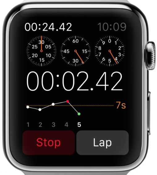
- Pan: navigating “wide area” content. The two primary examples are the Maps and Photos apps.
- Swipe: navigating between views and through content. There are multiple examples of this: especially the Mail, Fitness, and Activity Apps.
- Taps: the core interaction mechanism. The number of taps can cause different behavior (e.g: double-tapping on the Astronomy watchface changes how the planets are displayed).
- Force Push (Hard Tap): Exclusively used for showing options or settings. Throughout the keynote, the Force Push was only used to bring up the menu for an app or change how they work. More about app settings in a bit.
- Scrolling with the Digital Crown: Used in 3 different ways, depending on the context:
- Zooming in and out of “wide area” content
- Scrolling through content
- Setting values
Why Force Push should only be used for settings and options
Apple’s examples in the keynote make it very clear that the Force Push is meant for presenting users with options for your application. Every single demonstration of the Force Push was for showing settings and options. Here are the two biggest examples:
How to present options and settings
Apple gave us two great examples of how users should be able to change application behavior. Both involve Force Pushes, but the interface design for each category is radically different.
The first example can be called the “Control Center”. We saw this style used in the Music app, where you can Force Push to change the play order, source, and control AirPlay:
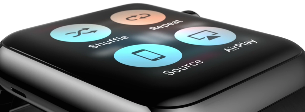
This style is meant for quick, straightforward actions. It uses the design metaphors from iOS’s Control Center to make the intention clear.
The second example is meant for complex customization and settings within an app. During the watchfaces demo, the presenter changes the color for a watchface and some of its behavior:
It was a whirlwind tour of how to effectively break down a complex settings view, but the following workflow was used:
- Force Push brings up the watchface selection view
- Tapping “customize” brings up the customization settings for that specific watchface
- The Digital Crown is used to adjust a setting’s value. In the first part, the watchface’s color was changed by scrolling the crown
- Swiping changes the settings category. In this example, we switched from changing the color to changing the individual sections of the watchface
- Tapping on an individual section highlights it (notice the green border) so that the setting can be changed using the Digital Crown
- Scrolling the Digital Crown changes the individual section
- A final Force Push applies the changes
One thing I noticed from the highlight reel was that a scroll bar was placed next to the digital crown when changing an individual section:
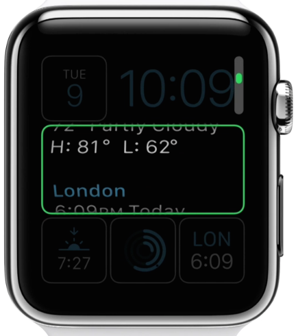
Presenting additional information
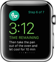
There are two ways to present information in a watchface app: through carousels or by scrolling. Carousels are used for navigating between different views, while scrolling shows additional information related to the current view. The best example of the difference between these two is in the Fitness app:
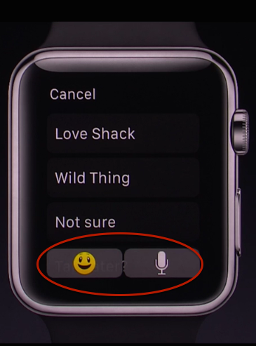
Overlaying buttons on a list
During the demo of the quick reply feature for messages, Apple gave an example of what to do when a list extends beyond the “pinned” buttons in an application. By making the buttons to dictate a reply or use animated Emoji translucent, the user can see there are more options in the list while still being able to use those buttons at any time.
User input
User input involves a combination of taps, swipes, and scrolling using the Digital Crown. The following principles seem to be what Apple is using for its interfaces:
When there are multiple values that can be adjusted using the Digital Crown, highlight the current one with a border:
Buttons should always be at the bottom of the screen and have plenty of padding, even if there are multiple buttons:
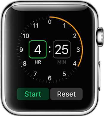
When there is a single value that the user can adjust, support both taps and the digital crown. And if you have an action that can be set multiple ways, use a carousel:
The user should not have to spend more than a few seconds entering values. Without a keyboard, the user’s only ways to control the app are through taps, swipes, and scrolling on a small device. This means that their dexterity is greatly reduced and they’re much less patient. And since the Apple Watch is a device designed to be used while in motion, time is also a significant factor.
Different types of apps
There are 3 different types of apps you can develop for the Apple Watch:
Glances are best used for quick overviews or notifications that don’t require an action from the user
Actionable Notifications provide a way for users to “reply” to actions from your application
A full-blown WatchKit App allows for user-initiated input and a customized experience
How to explain your application
A carousel was used to explain the Activity app during the Health and Fitness trailer. Given the limited ways to interact with the Apple Watch, the small screen, and the user’s expectations to swipe through an app to “progress”; a carousel is the best way to communicate your application’s intent and purpose during the first-run experience.
UI Kits
A few days after the keynote, impekable released a Photoshop template for a bunch of UI elements from the demos, keynote, and the Apple Watch site:
Apple Watch UI Kit: https://t.co/s4xQpygtpp pic.twitter.com/4EjPVmTpDT
— Meng To (@MengTo) September 22, 2014These are a great jumping off point for your own wireframes and mockups.
Conclusion
Regardless of any misgivings about the keynote, Apple’s done a fantastic job at thinking through the challenges of the Apple Watch user experience. The default apps present the ideal user experience, utilizing every part of the Apple Watch while creating quick workflows that can be used in almost any situation. Designing an application for a device this small and focused requires deliberate thought about the user interface. Now, more than ever, it’s critical to analyze and apply Apple’s design guidelines.
If you want to receive more helpful, in-depth guides like this to make your job easier, sign up for my newsletter and I’ll send them directly to your inbox.